

Branding
We design the mark, the visual system and the brand book together with the layer classic identities leave out - tokens, states and colour pairings checked for contrast. You judge the directions in an avatar, in a site header and on a company document, because that is where the mark will actually live. The first rollout we handle ourselves.
We have worked with leading companies and startups









Challenges
When a brand needs a new visual system
A rebrand is rarely needed because the logo got boring. Here are four situations where it is genuinely justified in business terms.
-
„Designed for print, used in an app”
Colour without sufficient contrast, type that fails at small sizes, a mark unrecognisable in a square avatar. A classic brand book does not answer the questions an interface asks - we extend it with the missing layer.
-
„The brand describes a previous version of the business”
A change of focus, a new segment or a transformed sales model. We know this one first-hand - we made the move from a graphic design studio to a UX agency ourselves, and we know how much of it is communication rather than graphics.
-
„Four deck templates, three shades of the company colour”
Without a system and a set of rules a brand drifts on its own, and every new piece of material needs the decisions made again. The cost is mostly time, and it grows with the number of people publishing anything.
-
„Several sites, no visible common thread”
Subsidiaries, product brands or several sites within one group. What is needed is brand architecture - a decision about what is shared and what is separate - and a system that can carry it.
Who it is for
Who we design brands for
-
Technology companies and SaaS in growth mode
The brand was put together in a week when the company was registered, in-house, and it now sits in an investor deck and on a trade-show stand. The product matured faster than the way the company looks.
-
Software houses selling abroad
At home the brand reads clearly, because clients know the founders by name. On a shortlist next to a supplier from Berlin or Amsterdam, the same identity steers the conversation towards price rather than competence.
-
Companies with a mark built decades ago
The mark is twenty years old, carries real value in its industry, and comes with a set of files nobody can open any more. The job is a modernisation that keeps the recognition built over two decades.
-
Companies competing for people
A candidate judges the brand earlier than a client does - in the job ad, on the profile and on the careers page. Those three places usually grew up outside marketing and look like a different company.
Our difference
Why companies trust us with their brand
-
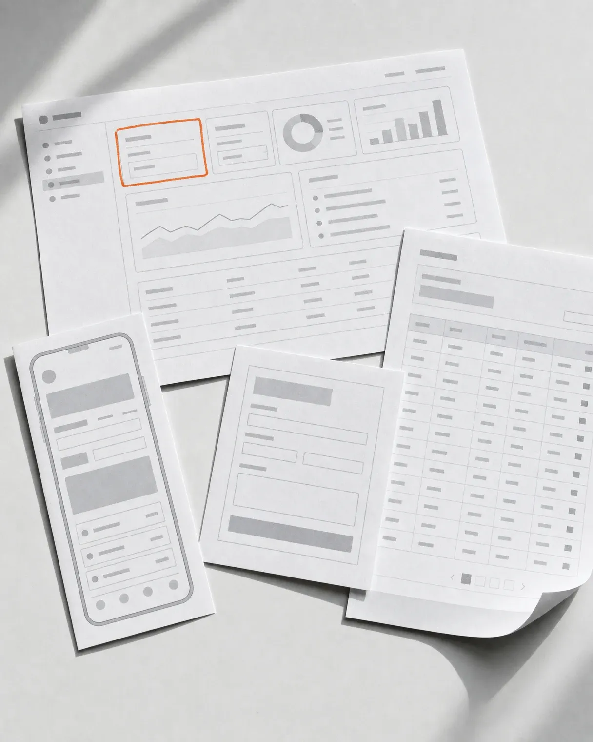
We start with an audit of what you already have
Recognition built over years is an asset rather than a starting point to be wiped. If extending your existing system with a screen layer is enough, we say so plainly and quote the smaller scope.
-
We check trademark availability before showing directions
Before you see any concepts we run a preliminary review of the EUIPO and Polish registers and of the marks already in use in your industry. A patent attorney runs the formal search, but a direction that fails at the start fails before it reaches a board presentation.
-
We roll out the first application ourselves
The system gets tested on a live site or in the product interface, because we design and build those under one roof. Trouble with scale, contrast and states surfaces in production rather than on a page of the book.
-
The working file is yours from day one
Mark variants, colour versions and type trials are visible while the work happens, not at a wrap-up presentation. Comments accumulate along the way, so a revision round closes the subject instead of reopening it.
Process
How we run it
- Week 1–2
Strategy workshop
Who you sell to and what, how you differ and how competitors speak. We come out with a brand platform that every later visual decision rests on - including what we deliberately will not do.
- Week 2–4
Mark concepts
Several directions shown in real applications rather than on a white board. A mark is judged in an avatar, in a site header and on a document, because that is where it will live.
- Week 3–6
Visual system
Colour with contrast checked against WCAG, a type scale, grid, iconography and composition rules. Tested straight away on an interface and on marketing material.
- Week 5–8
Brand book and tokens
Usage rules in a form both a designer and a developer work from - the book plus tokens in a format ready to drop into a digital product.
- Week 7–10
Rollout across materials
Company materials, presentation templates, social media and the first applications on the site. Support while your team or external suppliers roll it out.
Deliverables
What you get at the end
-
Brand platform
Positioning, points of difference and tone - the basis for visual decisions, without which each one is a matter of taste.
-
The mark in a full set of variants
Horizontal, vertical, symbol only, monochrome versions and minimum sizes. With rules for use on backgrounds and next to other marks.
-
Colour system with contrast
A palette with pairings checked against WCAG, so the brand colour can genuinely be used in an interface rather than only on a cover.
-
Typography and grid
Type scale, variants and composition rules - consistent for print and screen, with licensing chosen for the intended uses.
-
Brand book
Usage rules with examples of good and bad application. A document for everyone who will make material without your involvement.
-
Tokens for digital rollout
Colour, typography and spacing in a format a developer drops into the product. This is the layer classic identities lack, and without it the brand gets rebuilt from scratch in the interface anyway.
Toolkit
What we apply
An identity drifts exactly where the numbers stop and the eye takes over. Below are the thresholds, registers and formats we fix in advance, whoever's brand we happen to be designing.
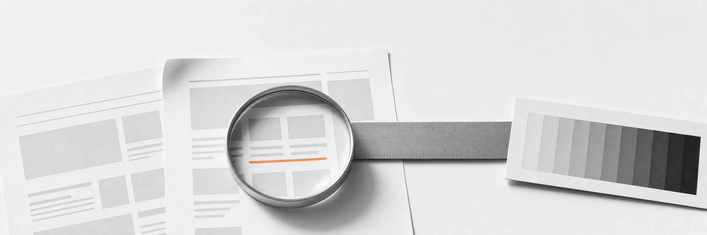
- WCAG 2.2 AA - 4.5:1 contrast for text, 3:1 for interface elements
- W3C design tokens, generated with Style Dictionary
- EUIPO, Polish Patent Office and WIPO Global Brand Database registers
- Colour specified in HEX, RGB, CMYK and Pantone
- Clear space and minimum sizes given as numbers
- Mark legibility checked from 16 px and in a square avatar
- Type licences chosen for desktop, web and app use
- Figma library published in your organisation

Next step
Let us talk about your project
Tell us what you have to do. We will come back with scope and a quote.
Selected work
Brands we have designed
This is our largest category of work - a selection is below. We show the full branding portfolio, including NDA work, during a consultation.
-
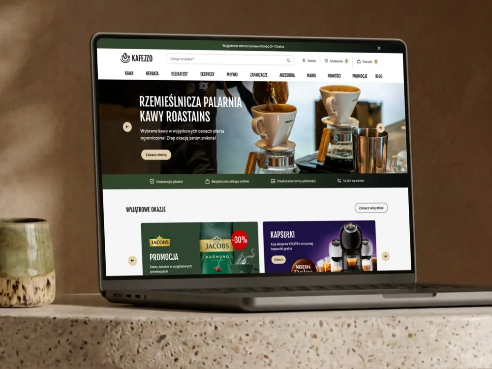
Kafezzo - Online store for coffee and tea
-
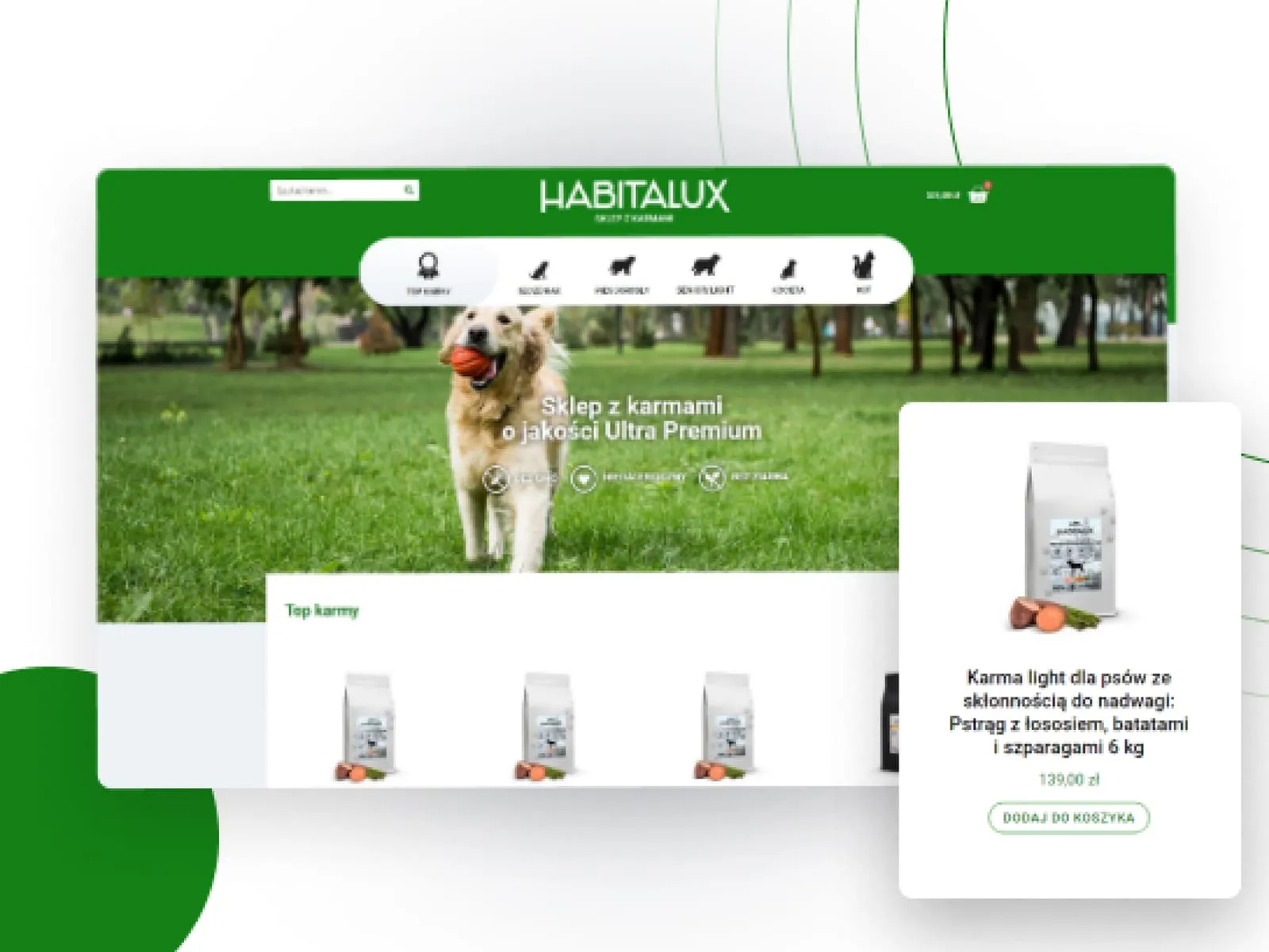
Habitalux - Online store and branding for pet food
-
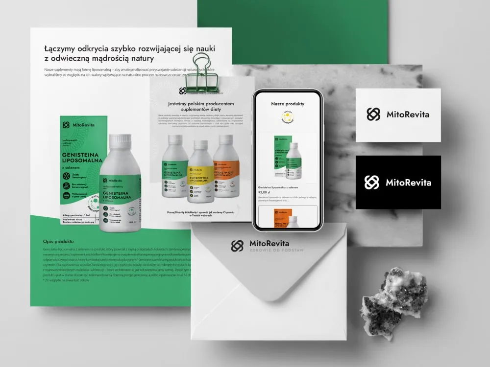
MitoRevita - Branding & store for liposomal supplements
-
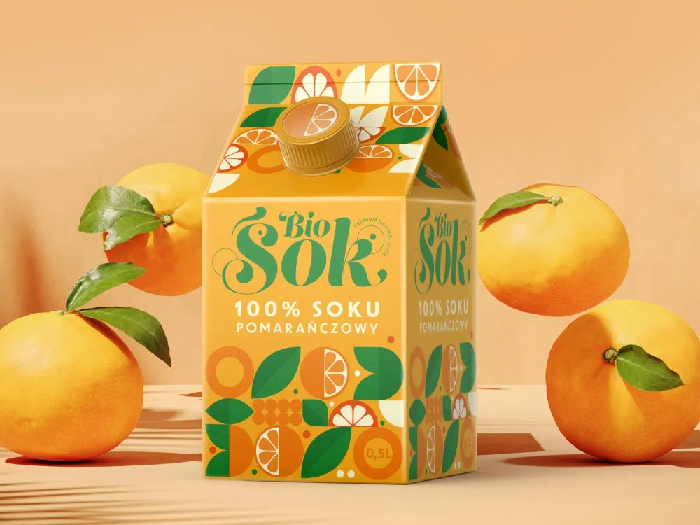
BioSok - Visual identity for a juice brand
-
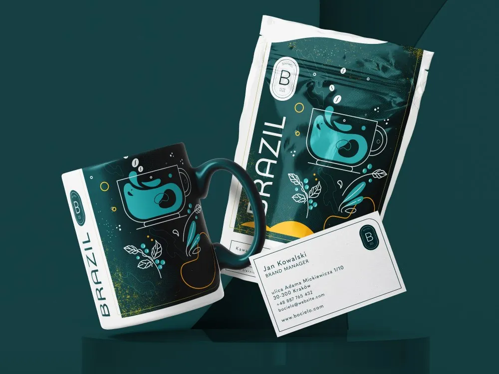
Bocielo - Visual identity for a coffee roaster
-
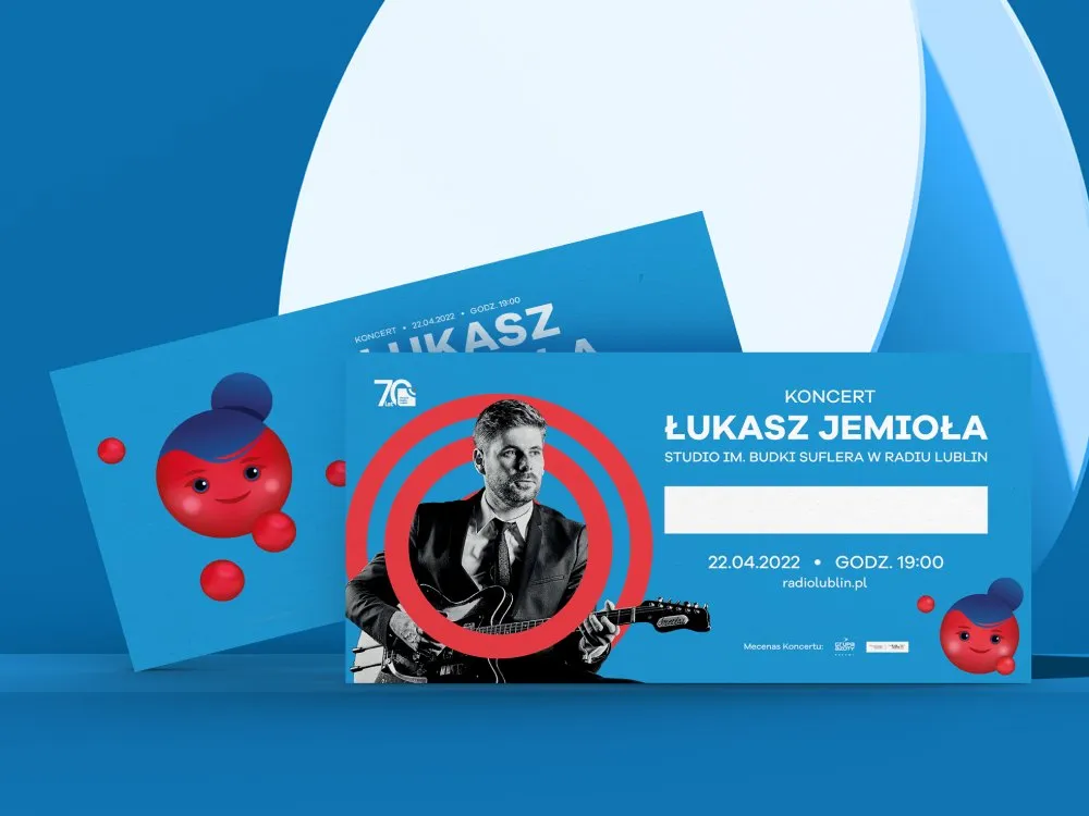
Radio Lublin - Identity for an anniversary campaign
-
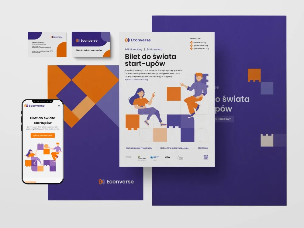
Econverse - Visual identity for a start-up event
-
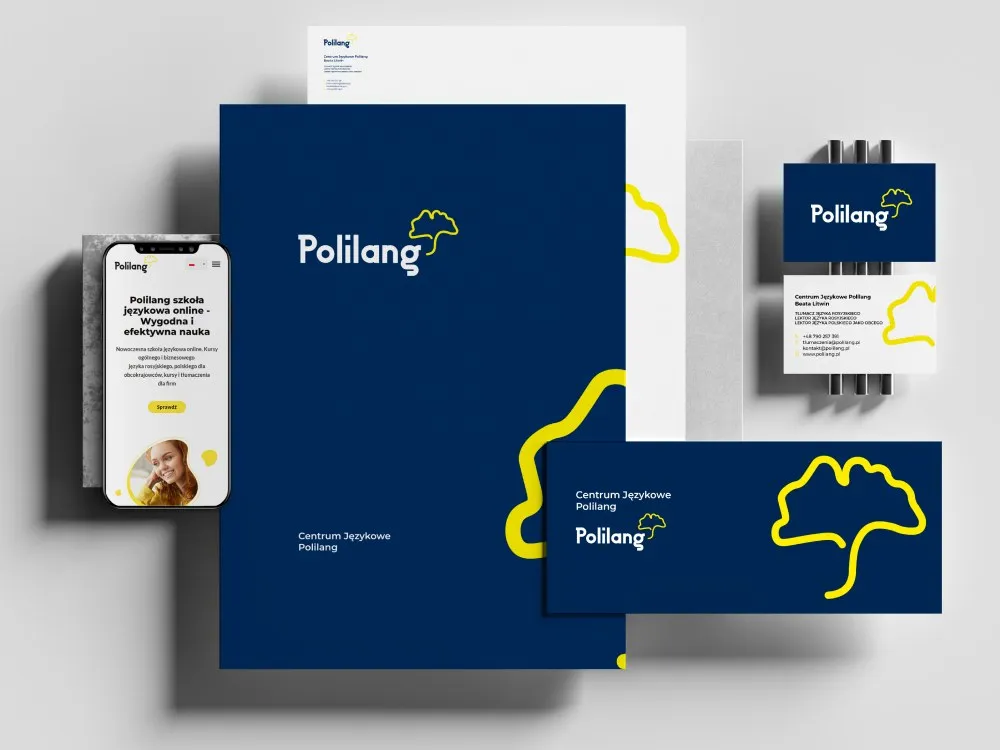
Polilang - Visual identity for a language school
-
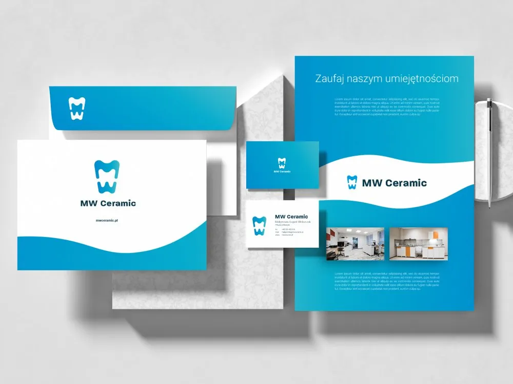
MW Ceramic - Visual identity for a dental ceramics lab
-
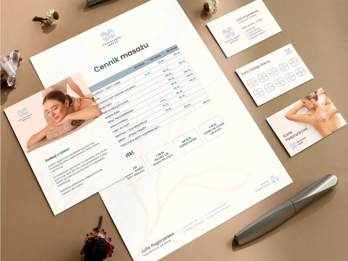
Przystanek Masaż - Visual identity for a massage studio
-
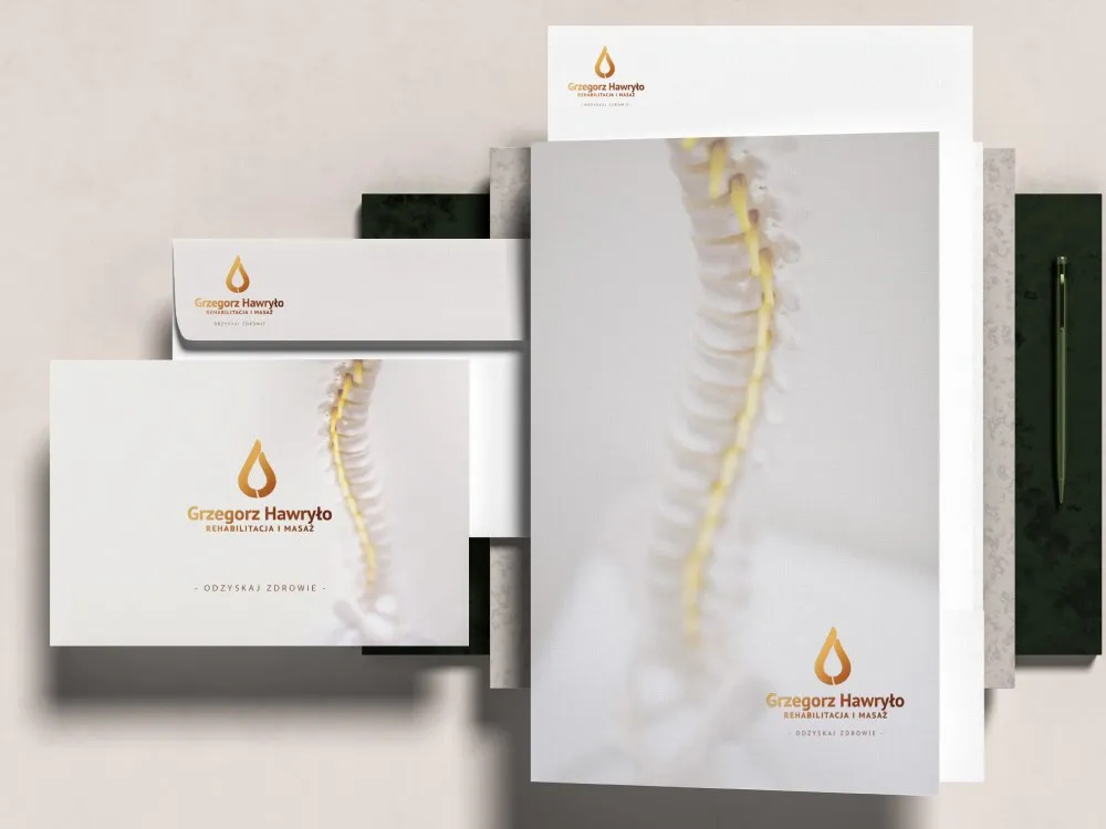
Grzegorz Hawryło - Brand for a rehab and massage clinic
-
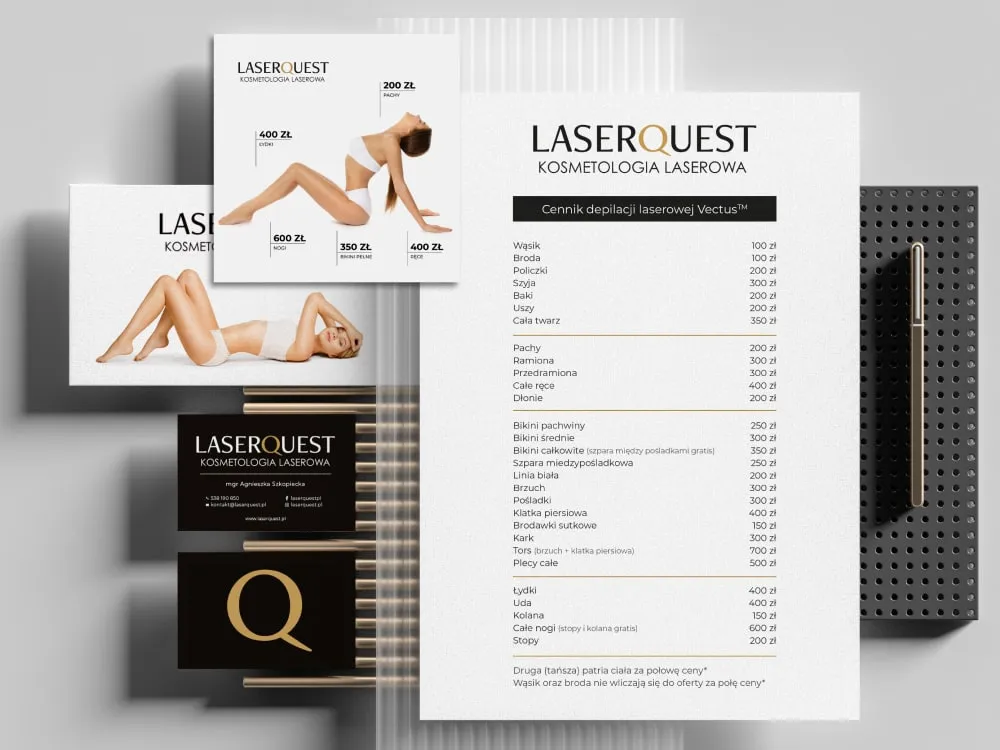
LaserQuest - Visual identity for a laser clinic
-
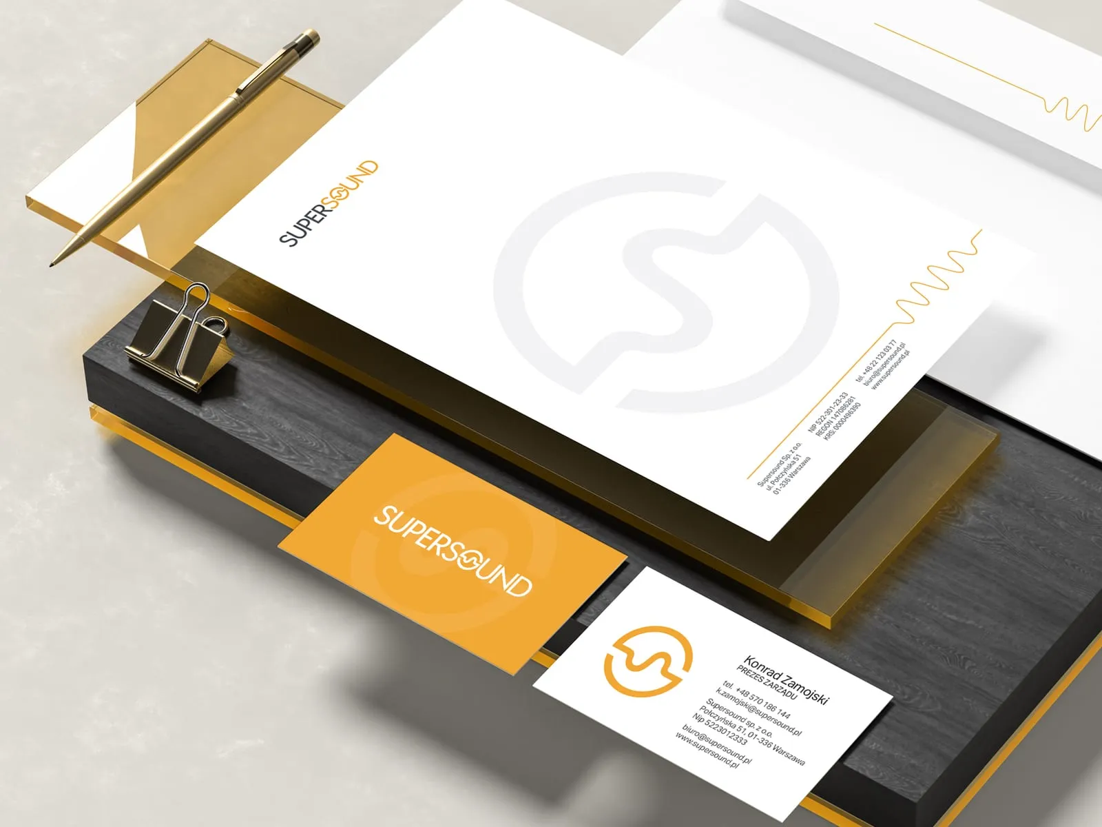
Supersound - Brand identity for an audio company
-
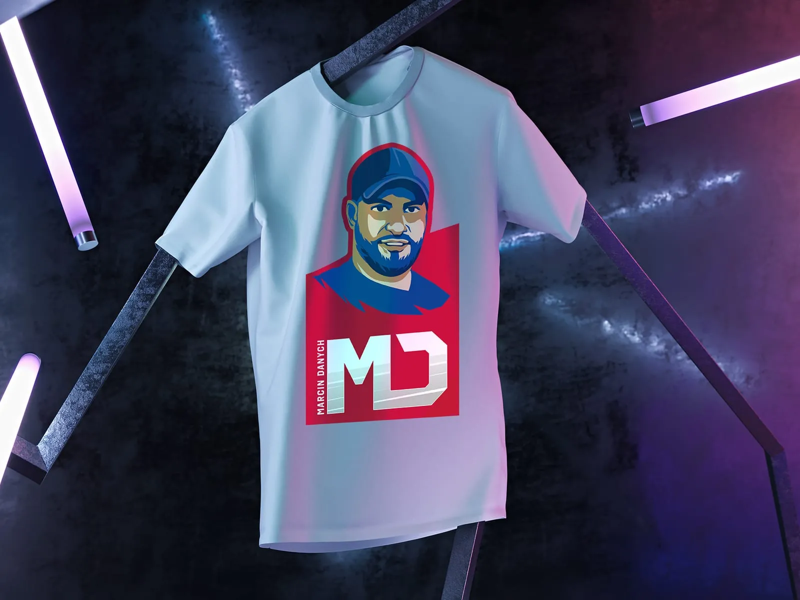
Marcin Danych - Personal brand logo and "Areny NBA Tour"
-
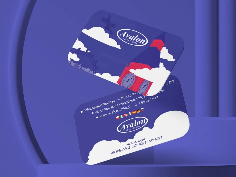
Avalon - Visual identity for a language school
-
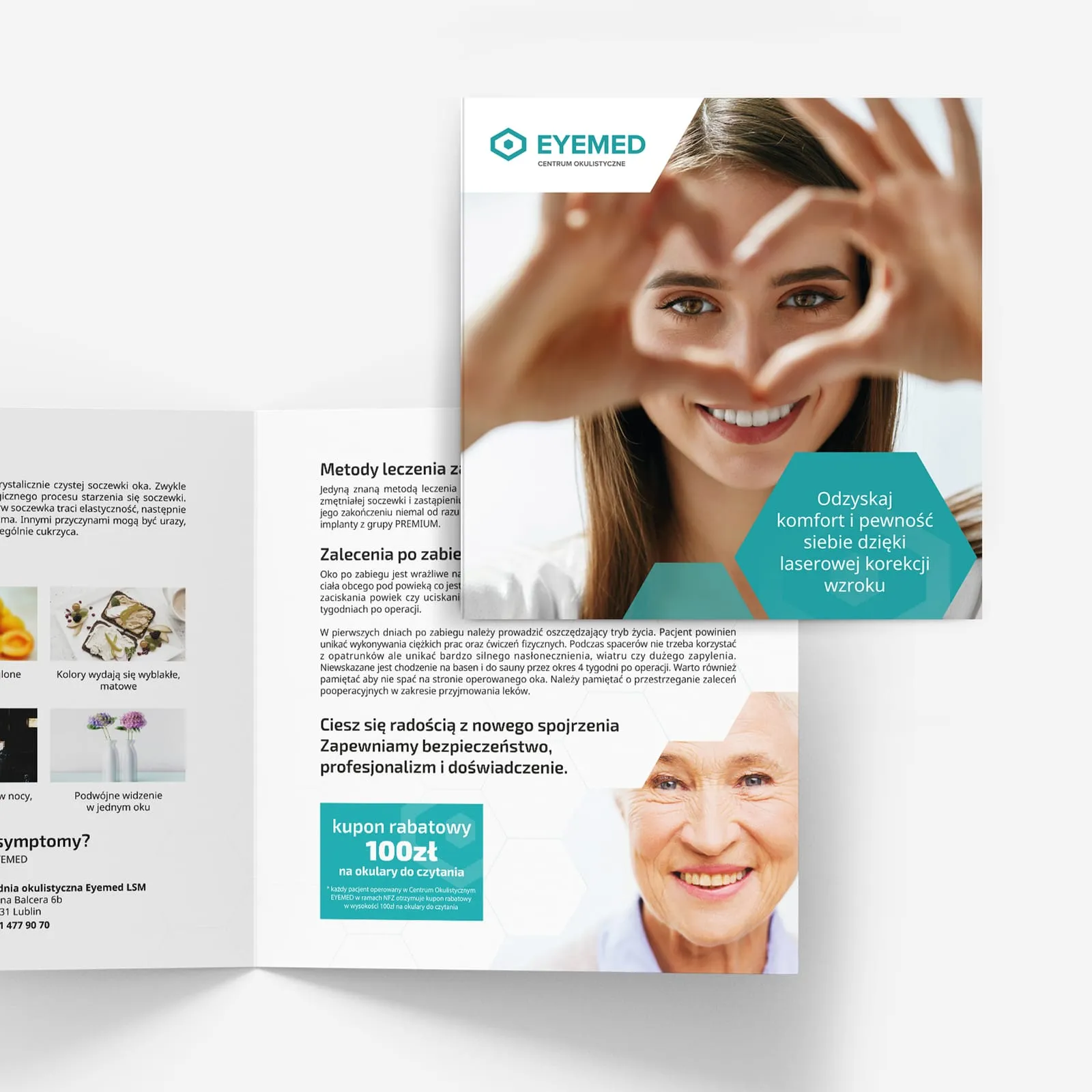
EYEMED - Advertising materials for an eye clinic
-
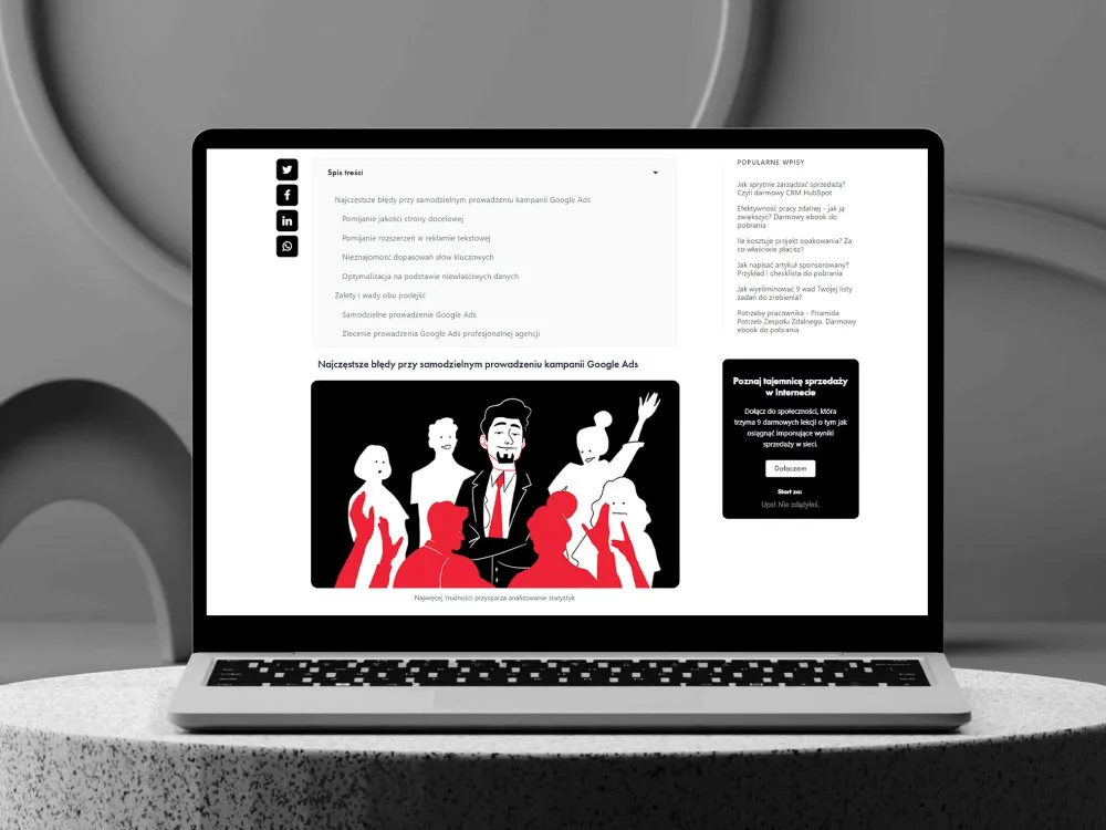
Bold - Editorial illustration system for the Bold brand
-
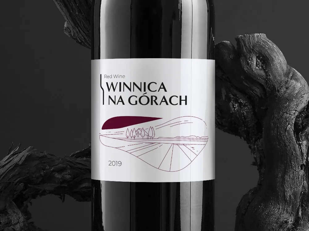
Winnica na Górach - Visual identity for a vineyard
-
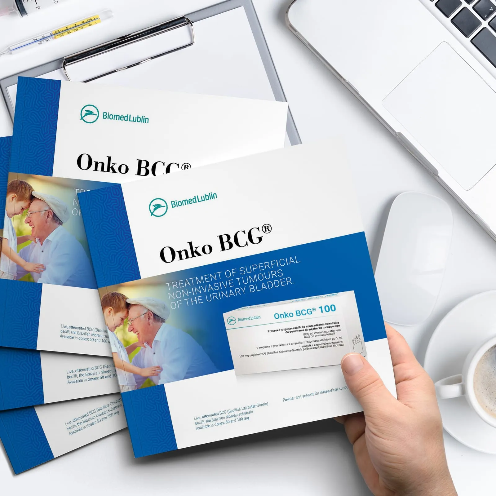
Biomed Lublin - Catalogue for the Onko BCG immunotherapy
-
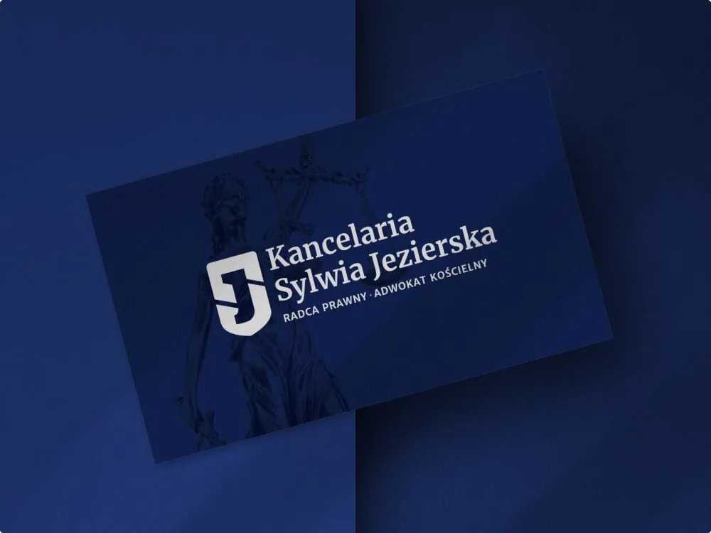
Kancelaria Sylwia Jezierska - Law firm visual identity
-
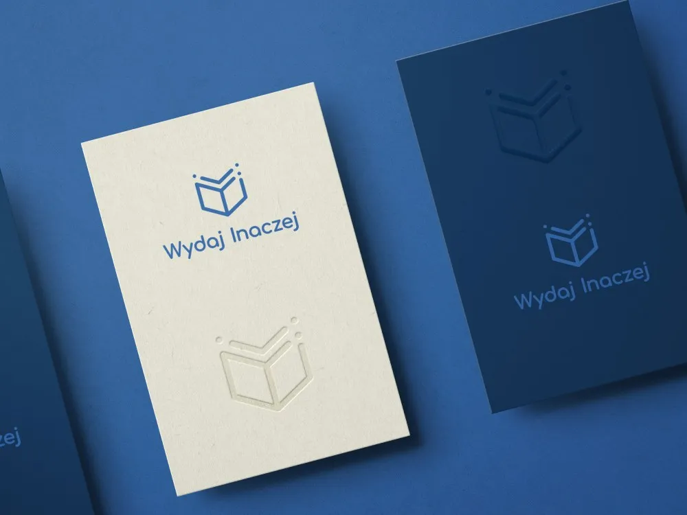
Wydaj Inaczej - Visual identity for a publishing house
-
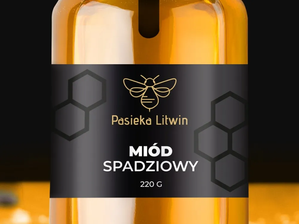
Pasieka Litwin - Visual identity for an apiary
-
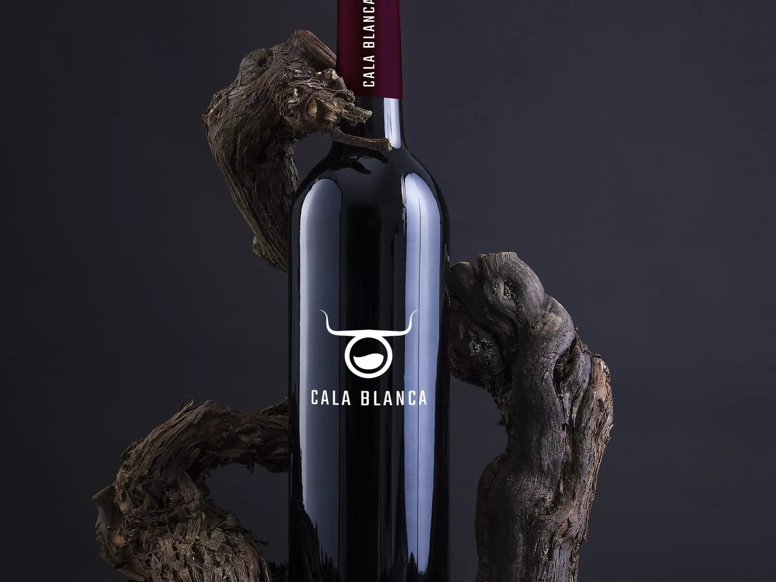
Cala Blanca - Wine label and brand identity
-
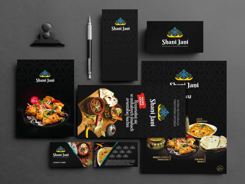
Shani Jani - Identity for a Pakistani-Indian restaurant
Outcomes
How you can check us before we talk
-
101
published projects in the portfolio - you judge the standard of our work before a contract, not after one
-
22
industries present in that portfolio - easy to check whether we have already worked in yours
-
3 sub-brands
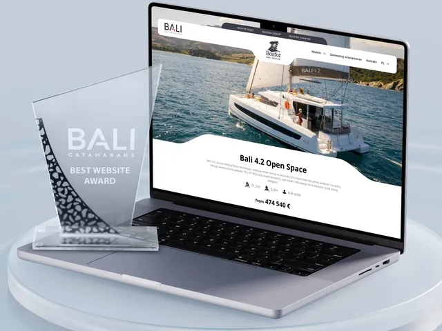
how many Bosfor Group brands we placed under one umbrella, in a system spanning four sites - brand architecture rather than a mark on its own
-
4.5:1
the minimum text contrast WCAG requires at level AA - every colour pairing is checked against it before it reaches the book
You can count the 101 projects and 22 industries yourself in the public portfolio at /en/projects/. The sub-brand architecture comes from the Bosfor Group case study at /en/case-studies/. The 4.5:1 threshold is the WCAG 2.2 requirement for body text at level AA, not an internal measure of ours. We do not publish the sales effects of a rebrand - we show those by name during a consultation, and some of the work is covered by NDA.
Client voices
What our clients say
-
„Working with the Wzór team was a genuinely great experience! They always answered our questions quickly and were flexible about our comments. They have no shortage of creative ideas and are at the same time thoroughly reliable and on time. The end result fully met our expectations; we recommend them to anyone looking for professionals who care.”
 Maja Wieloch-Silecka Operations Director, Bosfor Group
 -
„Our clients expect us to act fast and effectively across a very wide scope - from building a brand, through a website with a store, to running an effective sales campaign. Not an easy task, but doable when you have a tight-knit team and partners who take on challenges on the fly. For us, quality, accountability and commitment are key, and working with UX Agency Wzór gives us that 100%.”
 Piotr Alberski Chief Operating Officer, Agencja XO Media
 -
„Our cooperation with UX Agency Wzór started with our own website. We really liked the way they work, so we decided to subcontract projects for our clients to them on a White Label basis. We loved their workflow, the way they hand projects over to our team, their documentation and their work on the design system. Now we can take on bigger risks.”
 Mateusz Swół Chief Operating Officer, Sellace


Time and scope
How long it takes and what shapes the quote
6–10 weeks
From the strategy workshop to handover of the book and tokens. Architecture for a group of brands is a separate and longer thread - we quote it once the number of brands and the relationships between them are settled.
-
A single brand or a group architecture
-
Range of materials to be designed
-
Whether naming and trademark protection are in scope
-
Language versions and markets
-
Research scope - mark reception testing, competitor analysis
-
Rollout support and training for your team
FAQ
Questions that come up most often
What does a brand identity project cost?
We state the entry threshold upfront and quote the final figure only after scoping. The quote depends on the range of materials to be designed, whether we design one brand or a group architecture, the scope of research and whether naming is in scope too. We send a concrete figure within two business days of your enquiry.
We only need a new logo. Can we order just the mark?
You can, but we say plainly that it rarely solves the problem companies arrive with. A brand drifts because of missing rules rather than because of the mark - and then the new logo is in use in four colour versions within six months. If you still want the mark only, we quote that separately and more cheaply.
How does your branding differ from an advertising agency's?
In where our scope ends. We run branding as a UX agency, so colour gets checked for contrast in an interface, type at small sizes on screen, and the mark inside a square avatar. We also hand over tokens - the layer a developer drops into the product, which classic brand books do not include.
We have a brand book from years back. Does it have to go?
Usually not. What is more often missing is the on-screen layer - interactive states, contrast, a type scale, a grid. In that case we extend what you have rather than start over: it is cheaper, and the brand keeps the recognition you spent years building.
Are naming and trademark registration in scope?
Naming can be, and we settle that upfront, because it is a separate process and a separate quote. We do not handle trademark registration - we are not a patent law firm. We work with attorneys and can recommend someone to run it.
How many versions of the mark do you present?
Several directions, but always in real applications - in an avatar, in a site header, on a document. A mark judged on a blank board is almost always chosen differently from the same mark judged where it will live. That changes the conversation and usually shortens the number of rounds.
What if the board likes none of the directions?
We go back to the brand platform, because that is usually where the problem sits - if there is no agreement on how the company differs, every visual proposal gets judged on taste. Revision rounds are in the contract and you know upfront how many there are, so there are no budget surprises.
Who owns the rights to the mark?
You do. Economic copyright transfers under the contract, along with source files in every production format. We do not use time-limited licences or make ownership conditional on continued work with us.
We are doing branding and a website at once. Can they be combined?
Yes, and that is the natural order - the visual system first, then the digital product that uses it. We run both stages, so the mark does not have to be translated between two suppliers. If the site is the priority, see website design.
Related services