





Visual identity for an investment firm




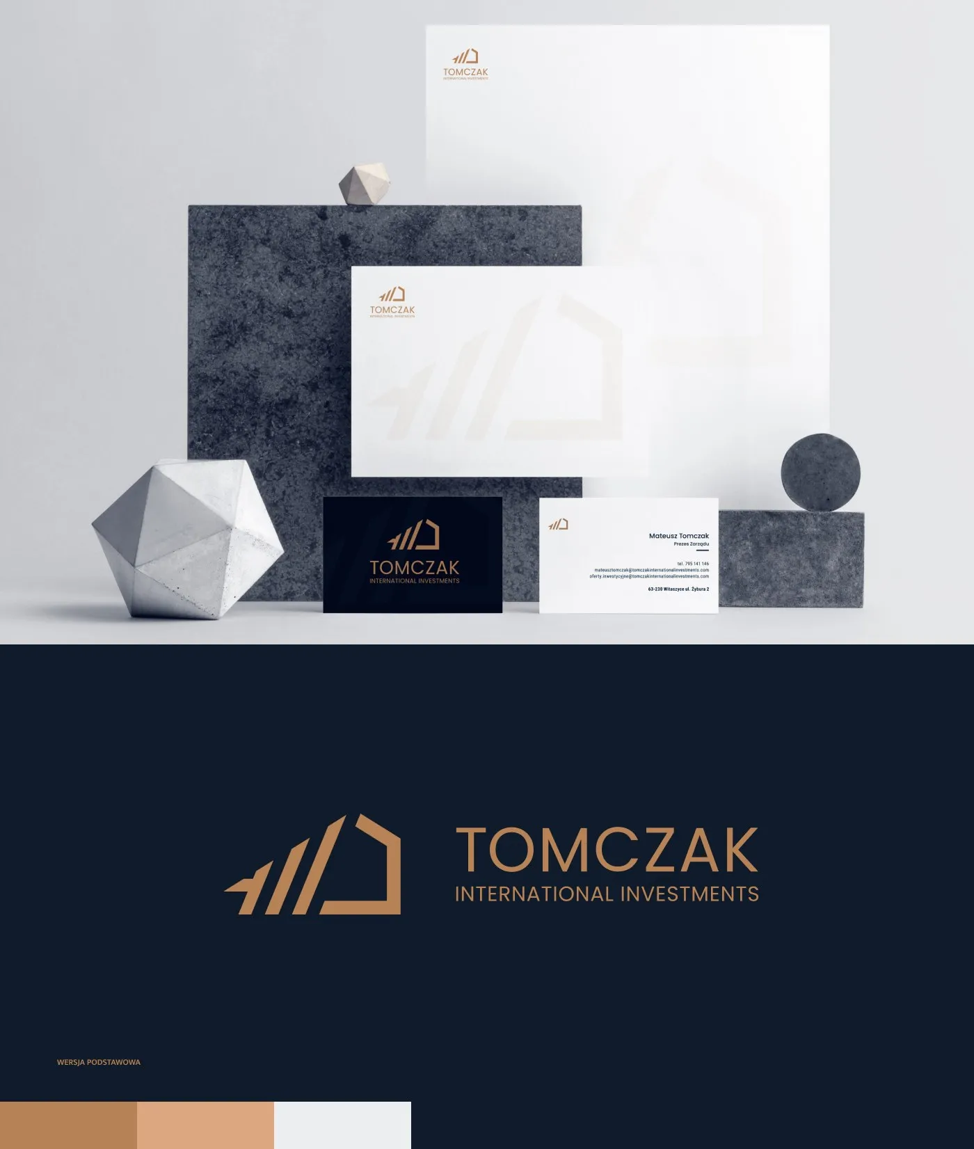
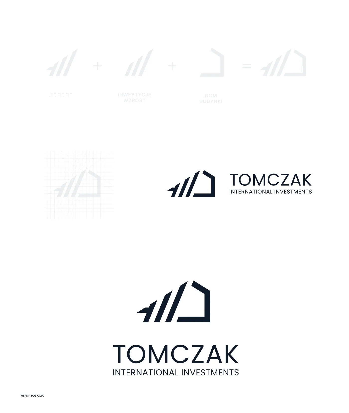
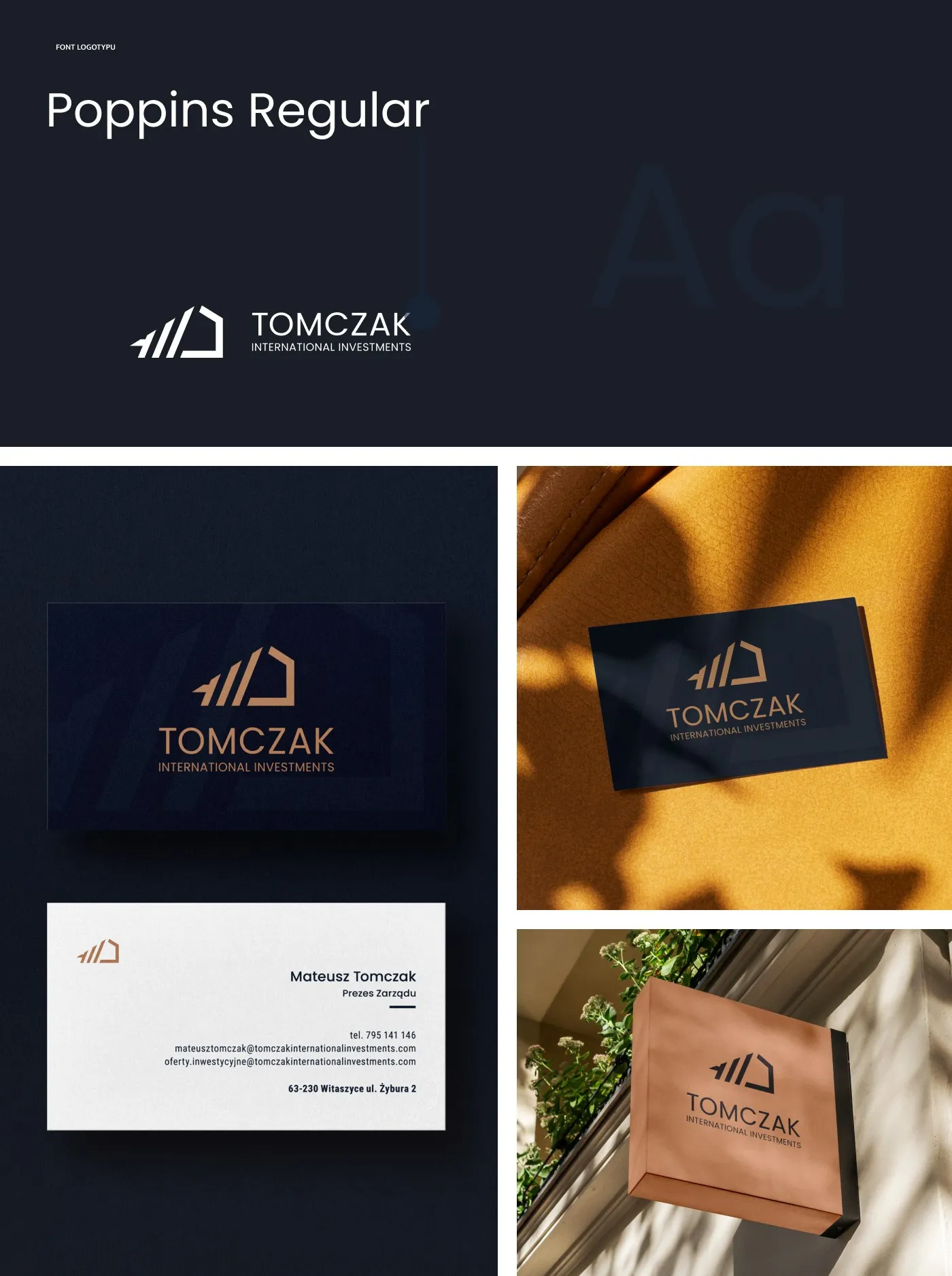
A visual identity for TOMCZAK International Investments - a geometric mark built from a building silhouette, a navy-and-gold palette, Poppins typography and collateral: stationery, folders and business cards with a gold-foil logo.

Book a free consultation with an expert to discuss your project and get answers to your questions.
- Patryk Korycki, CEO
Related projects

Kafezzo - Online store for coffee and tea

Habitalux - Online store and branding for pet food

MitoRevita - Branding & store for liposomal supplements

BioSok - Visual identity for a juice brand

Bocielo - Visual identity for a coffee roaster

Radio Lublin - Identity for an anniversary campaign
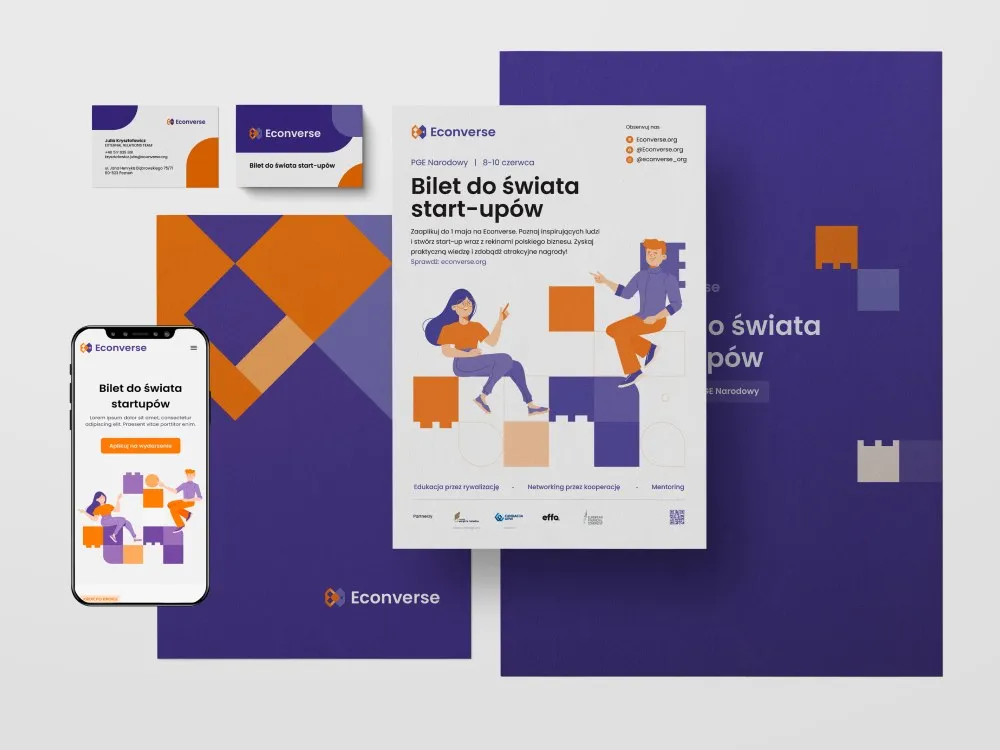
Econverse - Visual identity for a start-up event
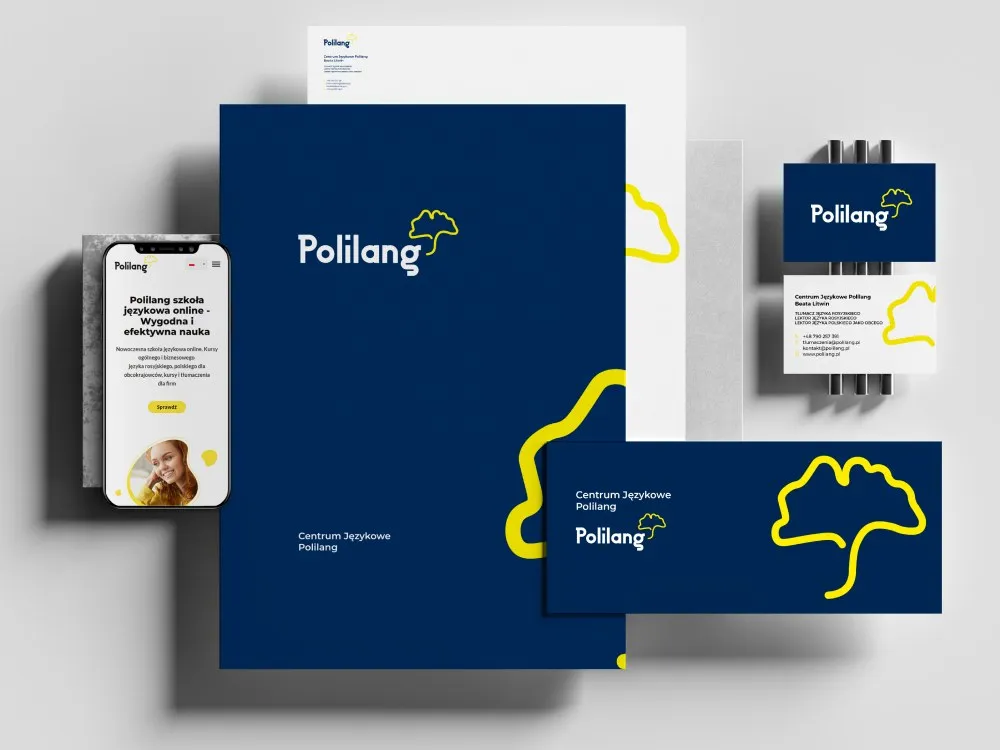
Polilang - Visual identity for a language school