

New UX/UI design for an online cosmetics store
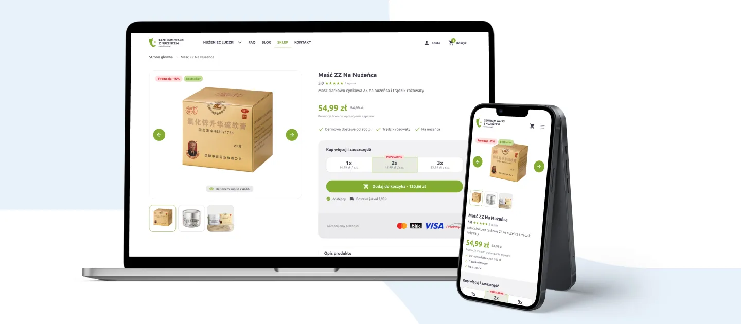
We modernised a store with a 10-year history, resolving every long-standing problem with conversion, responsiveness and information architecture.
- 3-person team
- 2 months of work
- 72 views
- mobile version
Key goals and challenges
We uncovered many serious UX issues in the store. Among other things, the information architecture had been built incorrectly. By that we mean organising content properly and giving it the right labels, so the user can move around the online store intuitively. Put simply: the customer should find what they are looking for.
Increasing conversion
Despite heavy traffic, conversion was incredibly low. The store’s UX design was meant to fix exactly that.
Eliminating errors
Over 10 years the store had accumulated a host of UX issues that demanded urgent intervention.
Mobile version
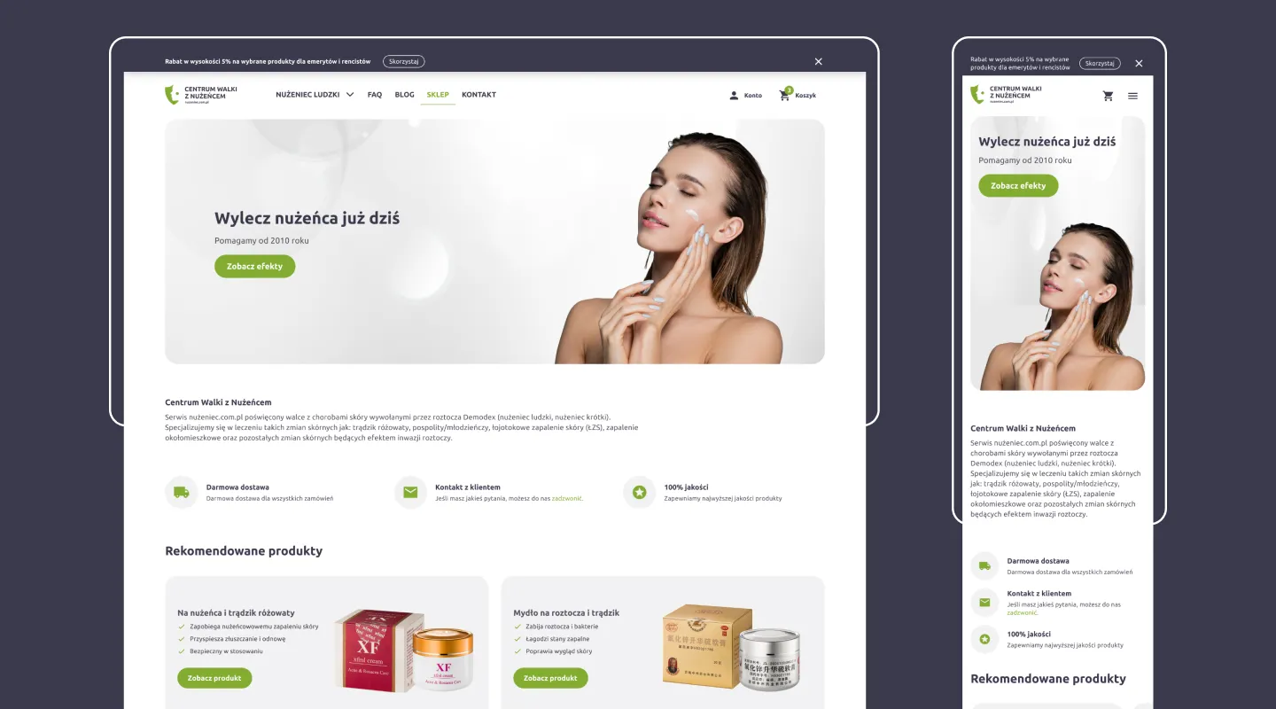
Until then the store had no mobile version, which was one of the factors behind its low conversion.
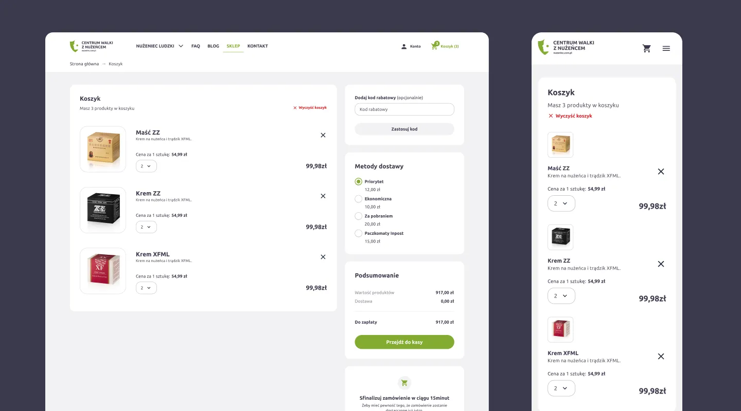
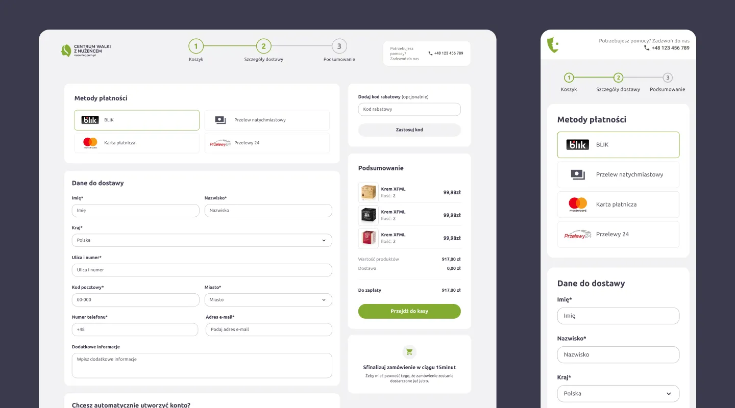
Delivery process
Years of running the store, and the many changes that came with them, meant the site had started to look like a blog. That was also driven by the desire to grow traffic from organic search results. Yet even though that worked, the store’s structure and appearance kept conversion at a very low level.
UX audit
Because the store was already over 10 years old and had gone through many changes over the years, the UX audit became the foundation for further work. Running it became the basis for setting the project’s goals, defining its timeline and estimating the effort.
Branding
Before moving on to the store itself, our team proposed several new branding concepts for the brand. Working through the entire design process together with the client, we chose the most appealing brand look for the target audience and created a complete visual identity.
UX/UI design
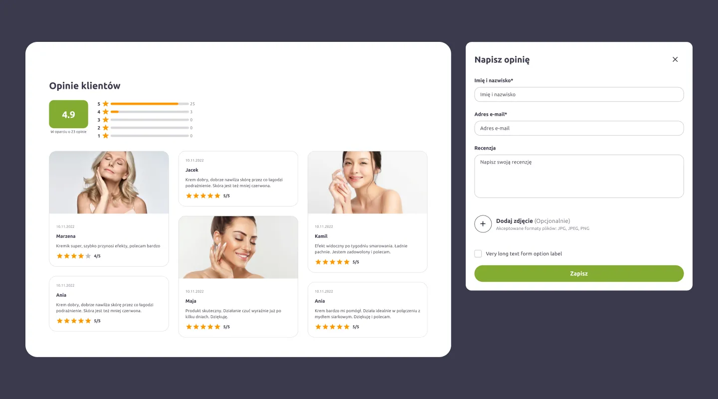
With a thorough analysis of the issues we had found in the store, we could prepare a new set of store mockups. On that basis we gathered all the feedback and worked out a new brand together with a refreshed user interface.
Preparing for implementation
The client had an in-house development team that handled the store’s implementation. Our job was to prepare the file for handoff properly and to keep communication going so the finished product could be delivered faster.
Scope of work
What we delivered

UX audit
Competitor research, Product analysis, Issue report

Branding
Logo, Visual identity, User interface

UX design
UX mockups, User interface, Store prototype
Results
Numbers that speak for themselves
- 2
- months of work
- 3
- people on the team
- 72
- store views
Similar work
See other case studies
-
E-commerce
Fonia
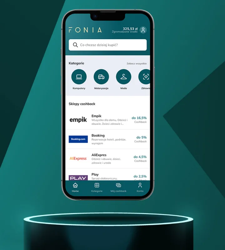
We built a cashback app that gives users a convenient space for online shopping where they can save money.
Read more →
-
Transport & Travel
Bosfor Group
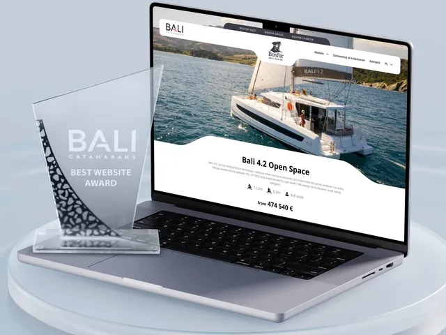
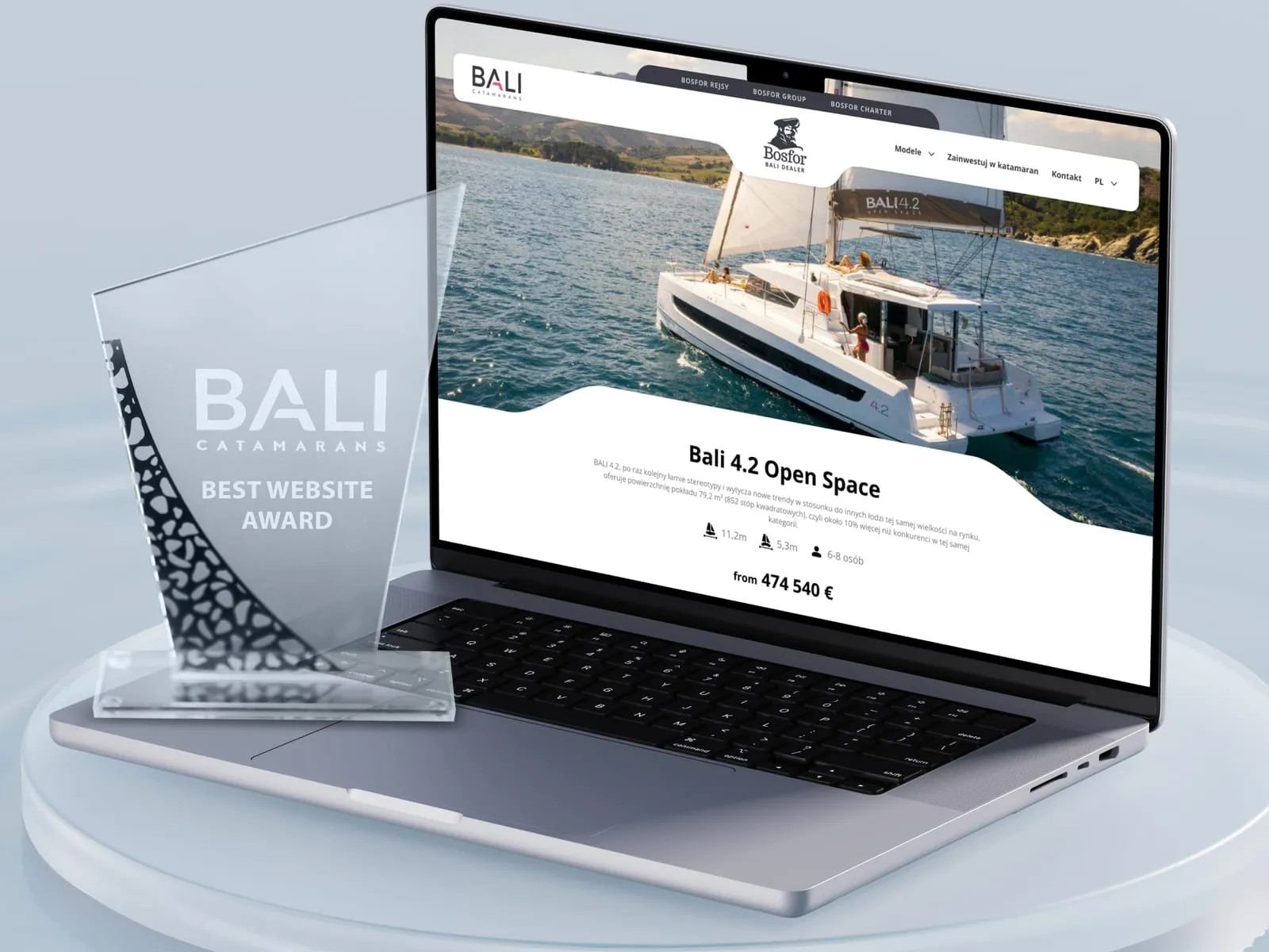
We merged Bosfor Group's four separate sites - the group hub, yacht charter, cruises and the BALI catamaran dealer - into one coherent brand system, with yacht booking and a catalogue built on technical data.
Read more →
-
Transport & Travel
EzzyGuide
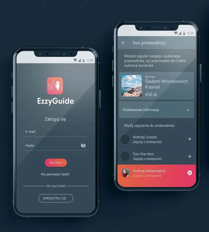
Building on an existing specification, we designed the UX of a tours app together with its user interface (UI).
Read more →
Contact
Tell us about your project
We design UX/UI for mobile, desktop and e-commerce applications - from audit and strategy to interfaces ready for implementation.