



Table of contents
An AI feature rarely fails because of the model. It fails in the interface: the user does not know they are talking to a machine, has no way to check the answer, cannot undo it, and when the feature does not run they see an empty rectangle. The model answers beautifully and usage sits flat.
This piece is about the four places where that gets decided, and the seven states missing from the first mock-up. It is the design side.
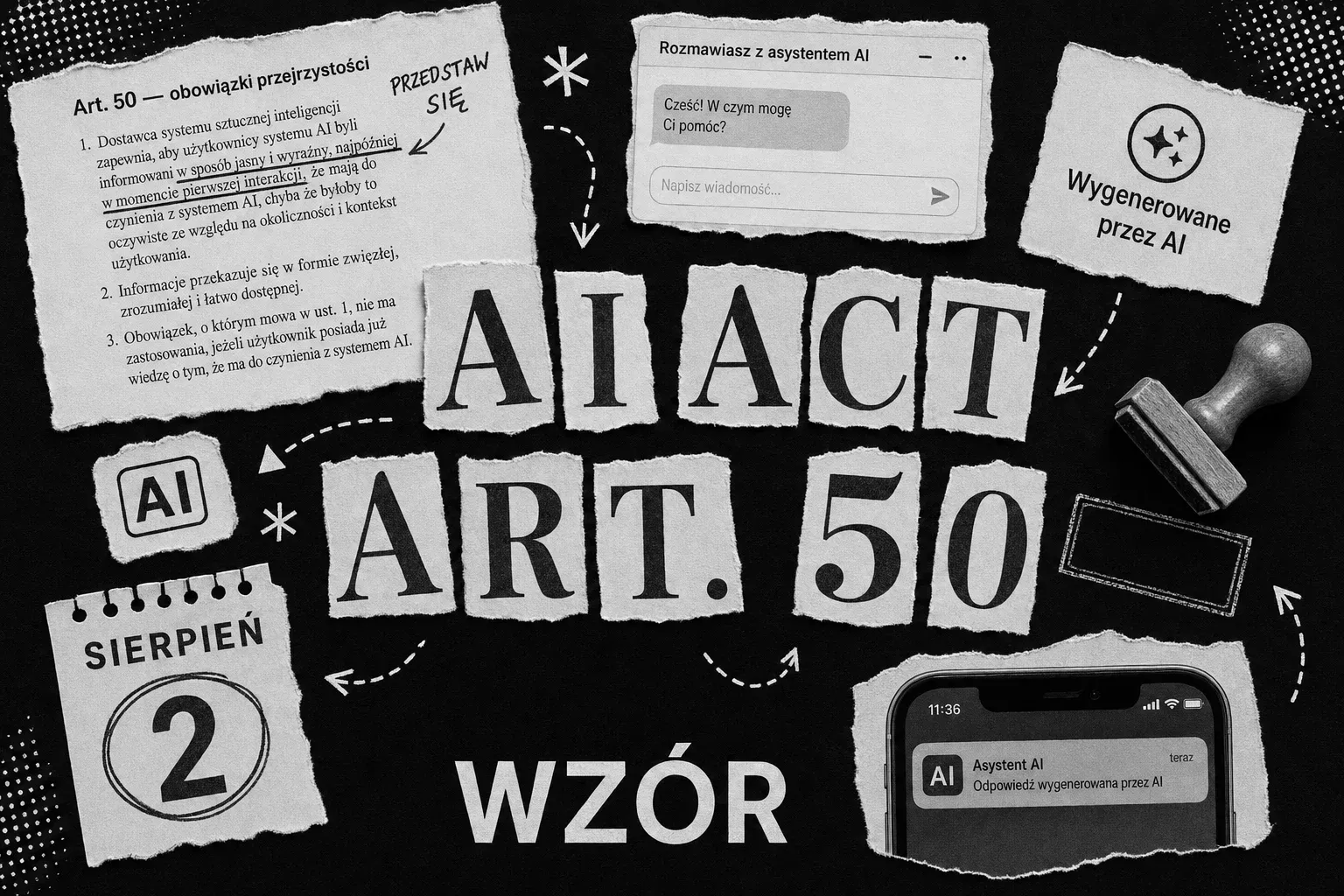
The legal side has its own piece: the transparency duties under Article 50 of the AI Act have applied since 2 August 2026, and we break them down separately - who they cover, what has to be marked and by when - in what has to be in the interface of a product with AI. Here the regulation appears only where it changes a design decision.
Three levels of exposure - and why chat is the most expensive
Not every AI feature costs the same. Google’s documentation on UX patterns for AI features sorts them by how much control you hand to the user. The split is useful because the level of exposure determines the design cost, before you write a single line of prompt.
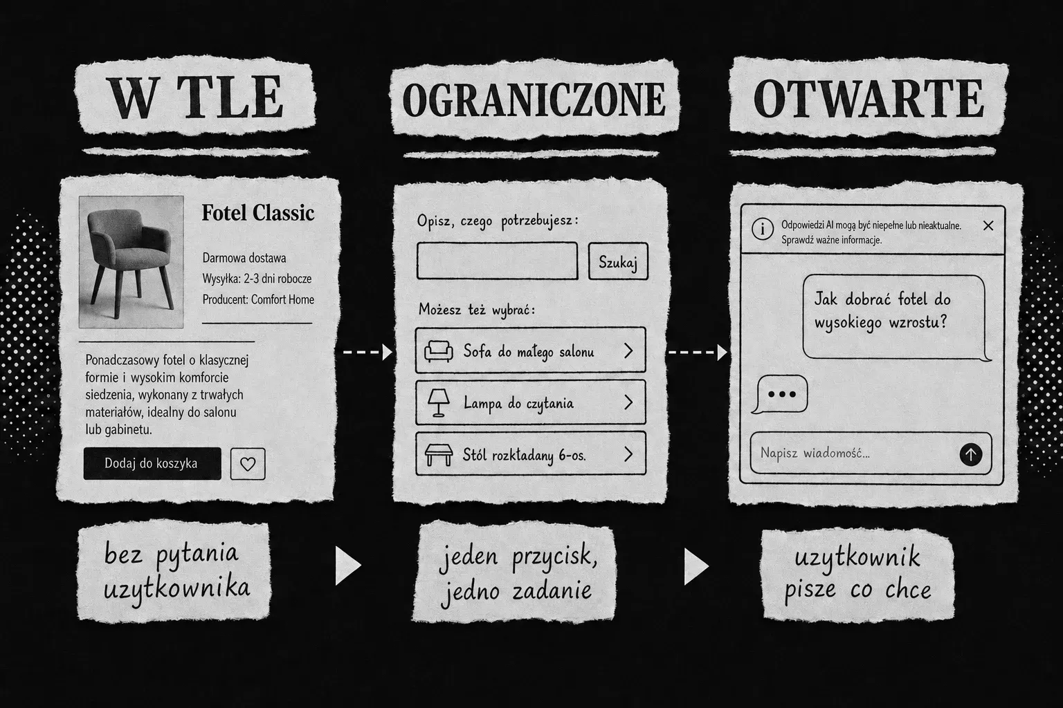
Background AI runs without the user’s involvement: a summary of reviews under a product, result ranking, duplicate detection. Nobody types anything, nobody has to understand how it works. Risk is lowest, because the product keeps its value even when the feature fails to run.
Constrained AI is one job behind one button: “suggest a title”, “shorten this description”, “fill this in from the contract”. The user knows they are invoking a feature, but does not phrase it freely. The output is predictable and the error space is countable.
Open-ended AI is a text field you can type anything into. Maximum flexibility and a multiple of the design cost, because you have to handle questions nobody anticipated and answers nobody approved.
Chat is the most expensive form of AI interface, and it tends to be picked first rather than last - because it looks like the simplest thing to build. The opposite is true: it hands the user the entire job of working out what to ask.
The rule we apply in projects: drop to the lowest level of exposure that still achieves the goal. If 80% of the questions put to an assistant are four repeating intents, that is not a case for chat - it is four buttons that always behave the same way, have their own error states and can be tested.
Pattern 1. Disclosure that is not a disclaimer
Teams design the “this is AI” notice the way legal clauses are designed: small type, grey, as far from the primary action as possible. That is optimising for “so nobody notices” - and it loses twice over, because the user works it out anyway, just later and with a worse impression.
Disclosure works when it sits with the feature, not with the page, and when it is text, not a symbol alone.
Disclosure in name only
- An asterisk and a sentence in the page footer, away from the feature.
- A paragraph in the terms of service, behind a separate link.
- A sparkle icon next to the button, with no text label.
- A notice shown once during onboarding and never again.
- “Meet Anna, your virtual advisor” with a human avatar and no mention of AI.
Disclosure that works
- A notice bar inside the assistant window, visible with the first message.
- A feature name that carries the information: “AI summary”, not “Quick insight”.
- A label on the output, not only on the button that produced it.
- A persistent, quiet marker in the interface - not a dismiss-forever banner.
- The same information in the voice channel, spoken at the start of the call.
There is one trap here that is invisible from inside the team: “but it’s obvious this is AI” is almost never the user’s judgement - it is the judgement of someone who has spent a quarter on the feature. If you want to settle it, settle it with research, not in a meeting.
Pattern 2. Show where the answer came from
An output that cannot be checked is worth exactly as much as the trust placed in it - and trust without grounds turns into one of two things: blind acceptance, or abandonment of the feature. Both are bad; only the second shows up in the data.
Three things that fix it, cheapest first:
Cite the source. If the answer came from the customer’s documents, show which document and which section, with a link that opens the original in the same context. This is the single strongest element for building trust in a feature grounded in company data.
Show the scope, not just the result. “Based on 128 reviews from the last 90 days” says more than any assurance of accuracy. The user will judge for themselves whether the sample is enough.
Write in language that does not fake certainty. This is a system-prompt setting, not a copywriting task at the end. “It appears the contract does not contain a termination clause” and “The contract does not contain a termination clause” are sentences carrying different liability. If the model has no basis for the second, it must not write it.
Pattern 3. Control - undo, edit, turn off
An AI feature that cannot be reversed pushes onto the user a risk they do not control. The minimum is three exits: undo the result, edit it instead of accepting or rejecting it wholesale, and turn the feature off permanently.
That last one tends to get pushback from product teams (“why offer a switch for the thing that is our advantage”). The argument runs the other way: an off switch turns a sceptical user into a user who stays. Without it, the sceptic becomes a lost user, and you never find out why.
And one thing that looks obvious yet gets skipped: the product has to work when the AI feature does not. Models go down, quotas run out, vendors change terms. If the summary fails to generate, the user should see the full list of reviews, not an empty rectangle with an error message.
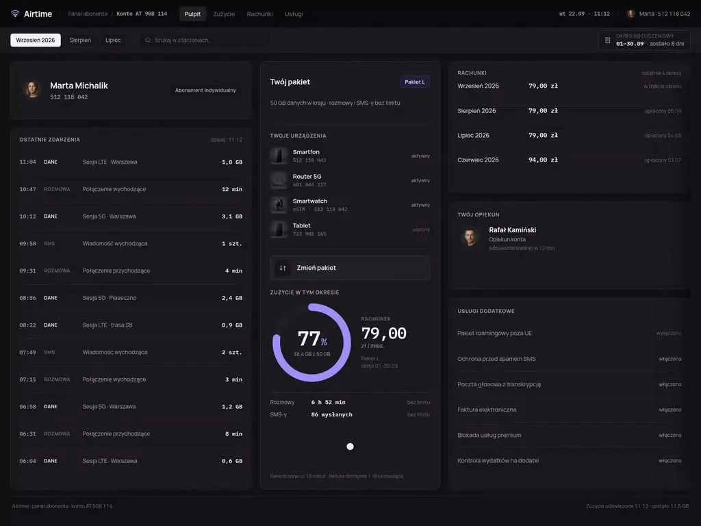
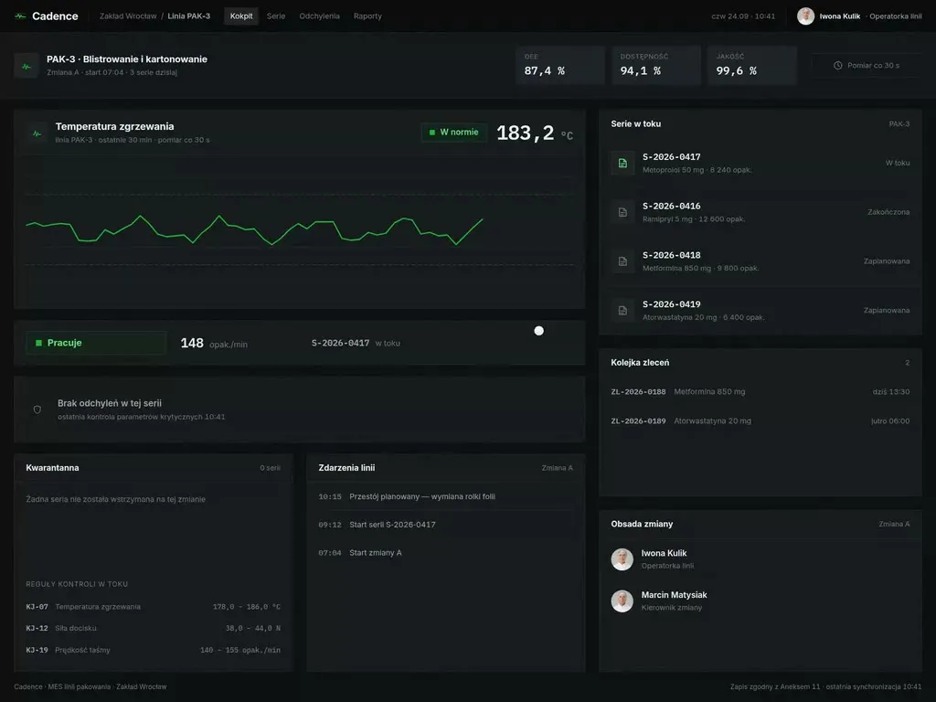
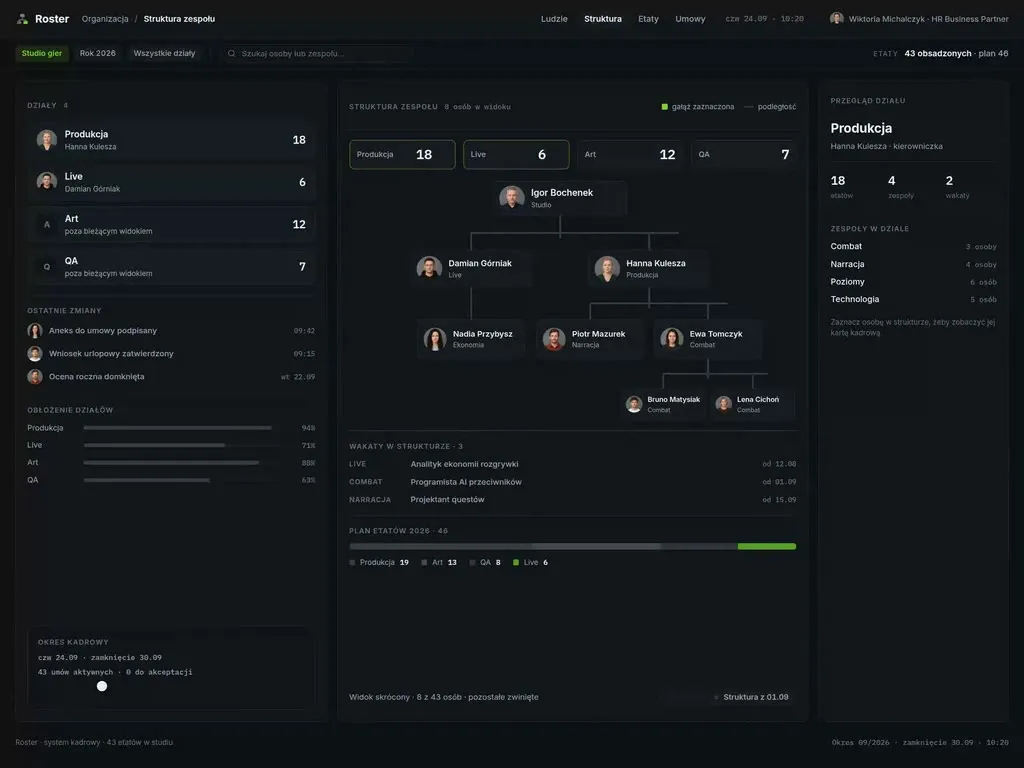
Trust and control patterns are not, incidentally, an invention of the AI era. We were solving exactly the same problem - “the machine calculated it, the user has to believe it and act on it” - in quote calculators and B2B panels long before a language model entered the picture:
In both cases the design work came down to the same thing: show the components of the result, let people change the assumptions, and never ask the user to take a number on faith. An AI feature raises the same question, only with more uncertainty on the system’s side.
Pattern 4. The seven states the first design forgets
A mock-up of an AI feature almost always shows one state: the successful result. Production shows seven. The list below is not theory - it is the set of screens whose absence surfaces at the first demo with real data:
- Loading / streaming. An answer appearing gradually needs different treatment from a spinner: you have to decide whether it can be interrupted and what happens to half a response.
- Empty. No data to summarise is not an error. It is a message explaining what is missing and what to do about it.
- Low confidence. The model answered, but without support in the sources. This state has to be designed deliberately; otherwise it looks identical to a confident one.
- Refusal. The system will not answer because the question falls outside its scope. State the scope instead of leaving a wall.
- Quota. The request allowance is used up. When it renews and what can be done now.
- Technical error. With whatever the user has already typed preserved - losing entered text hurts most here.
- Disabled. Feature unavailable on this plan, or switched off by an administrator.
Four things that break this component’s accessibility
The AI notice bar is a small element holding a surprising number of mistakes - and it is exactly the kind of element that gets designed in a hurry, because it looks like a detail. Accessibility requirements apply to it like the rest of the interface; we wrote separately about who the Polish Accessibility Act really covers.
- information carried by an icon alone - with no text available to a screen reader.
- a streamed answer without
aria-live- the reader either does not announce new content, or announces every fragment separately. - contrast below threshold on the “AI” label, because it was meant to be discreet.
- focus moved into the answer while it is being generated, throwing a keyboard user out of the input field.
Where these patterns live - in the design system, not on a screen
Every team reaches this conclusion, usually after the third AI feature in the same product: if disclosure, provenance, control and states are designed separately for each feature, by the third time you have three different answers to the same question. Three labels, three error messages, three behaviours for the undo button.
AI patterns belong to the system layer exactly as much as a button or a form field does:
- a disclosure component in variants (a bar in the window, a label on the output, an inline marker in the content).
- an AI result pattern with slots for sources and data scope.
- a set of states as first-class component variants, not as notes in the documentation.
- microcopy - one place where it is decided that we say “It appears”, not “Certainly”.
- a streaming duration token and a rule for behaviour under
prefers-reduced-motion.
A design system that holds this has one more property, which we covered in the piece on the design system that powers AI during implementation: it is legible to code-generating tools. A pattern recorded as a component with named states comes back from the generator as that same component. Recorded as a paragraph in a document, it comes back as a <div>.
What to measure to know whether it works
The number of times an AI feature is invoked says nothing about its value. Four metrics that do:
Share of outputs accepted without editing. Too low means the feature is creating work instead of removing it. Too high, on answers that cannot be verified, means blind trust - and that is a warning sign, not a success.
Share of outputs edited rather than discarded. An edit is the best possible outcome: it was worth the user’s while to start from the system’s proposal.
Undo rate. A rising undo curve against a flat invocation count means the feature is starting to behave differently from what users expect.
Share of users who turn the feature off. The most uncomfortable metric, and therefore the one least often instrumented. If it climbs, no other number compensates.
Design checklist
To run through before an AI feature reaches users. This is the design list - the formal duties have their own checklist in the piece on Article 50.
- The feature sits at the lowest level of exposure that achieves the goal - chat is a decision, not a default form.
- The AI notice appears with the feature, at the first interaction, and is text, not an icon alone.
- The output shows the source and the scope of data it was built from.
- The answer’s language does not fake certainty the model does not have - and that is written into the system prompt.
- The user can undo, edit and turn it off - all three, not one of them.
- The product keeps its value when the AI feature fails.
- All seven states have a designed screen, not just the successful one.
- The component passes a screen-reader, contrast and keyboard check.
- The patterns live in the design system, not in one screen’s file.
- You instrument acceptance, edits, undos and opt-outs.
If the answer to any of points 2–8 is “next iteration”, the feature is not ready - however well the model answers.

Co-founder and President of the UX agency Wzór. Business analyst - she leads interface projects for mobile, desktop and e-commerce applications, from business analysis, research and information architecture to polished UI.