New UX/UI Design for an Online Cosmetics Store

We modernized a store with a 10-year history, solving all previous issues.

The client came to us with a significant problem. The store's template was over 10 years old and required urgent attention. Despite high website traffic, sales were declining. This was due to an outdated design and, most importantly, a lack of responsiveness.
  • 3-person team
  • 2 months of work
  • 72 views
  • Mobile version
Client
CWZN
Industry
E-commerce
Type
Cosmetics Store

Key Objectives

We identified several critical UX issues in the store. One of the main problems was the information architecture, which was poorly structured. This involves organizing and naming content in a way that allows users to navigate the store intuitively. Simply put, customers need to be able to find what they are looking for easily.
Increasing Conversion
Despite high website traffic, the conversion rate was remarkably low. The UX redesign aimed to address this issue.
Eliminating Errors
Over the 10-year span, the store accumulated numerous UX errors that required immediate attention.
Mobile Version
The store previously lacked a mobile version, which was also a factor contributing to the low conversion rate.

Project Execution

The store's long history and numerous changes had caused the site to resemble a blog. This was partly due to the desire to increase traffic from organic search results. While this goal was achieved, the store's structure and design led to a very low conversion rate.
Since the store was over 10 years old and had undergone many changes, the UX audit became the foundation for further work. Conducting this audit was essential for setting the project goals, establishing the timeline, and estimating the workload.
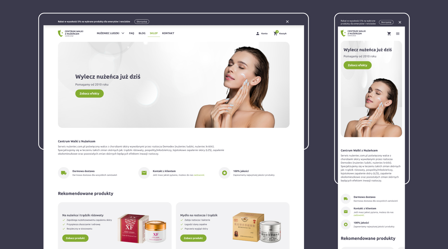
Before moving on to work on the store, our team proposed several new branding concepts for the brand. Going through the entire design process with the client, we selected the most appealing brand look for the target audience, creating a comprehensive visual identity.
With a thorough analysis of the issues we encountered in the store, we were able to create new wireframes for the store. Based on this, we incorporated all necessary feedback and developed a refreshed interface along with the new brand design.
The client had a development team responsible for implementing the store. Our task was to properly prepare the implementation files and maintain constant communication to ensure the faster delivery of the final product.

Scope of Work

We were responsible for designing the information architecture, user flow, conducting a UX audit, and creating the store's UX design.
UX Audit
Competitor Research, Product Analysis, Error Report
Branding
Logo, Visual Identity, User Interface
UX Design
UX Wireframes, User Interface, Store Prototype

Results

Over the course of two months, we designed an improved version of the existing store, focusing on both SEO and usability. We brought a fresh approach and incorporated the most up-to-date e-commerce solutions.
2
months of work
3
person team
72
store views

Similar Case Study

Wzór Copyright © 2023 All Rights Reserved
Privacy Policy
linkedin facebook pinterest youtube rss twitter instagram facebook-blank rss-blank linkedin-blank pinterest youtube twitter instagram